Banking
Released
Desktop
Santander Web Redesign
A platform left behind but still very much in use needed to reach current standards. Thanks to our vision, the renewed site gave us a 48% increase in NPS and an international design award.
This case study was made with AI assistance for style, grammar, and length corrections. Everything was proof-read by me and corrected in instances I deemed necessary. All general and particular ideas presented are completely my own.
Background
Context
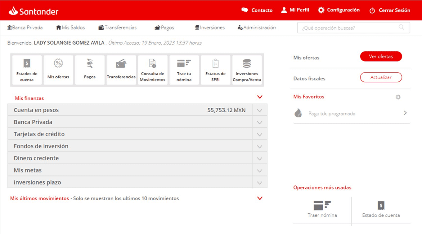
SuperNet's features and overall experience have never undergo UX revisions and improvements, this resulted in SuperNet suffering of confusing interactions and navigation. The platform was stagnant because new users wouldn't come thanks to severe frictions and current users had no choice but to use a cumbersome experience.
Oportunity
In its state, we had plenty of room for a clearer and straightfoward experience on par with our mobile app that can have a great impact in growth, overall user perception and the first step towards an omnichannel experience.
Pain points
Users were taking long times to do operations that were much more quicker in mobile
Users couldn't find less frequent operations in our website
UI and interactions were no longer familiar for users of other, more used channels
Since 2018, Santander México has pushed its digital transformation with a mobile-first strategy. While it greatly improve the bank's position in the most important channel that is mobile; the web banking experience, called SuperNet, was falling behind and kept its functionality and design stuck in an era before any design thinking was implemented.
Knowing that there was no plans on rebuilding the webapp, the product team proposed an update to SuperNet focused on UI redesigns and other small fixes that would bring the interaction closer to the current branding and design system.
SuperNet was Santander's desktop web platform and in 13 years, the website had not received an update in user experience, so a full redisign was in dire need.
Stakeholders
We started as a two-man team for the SuperNet update, but after having a look at the state of the platform we proposed to do something much bigger and with the help of all the stakeholders we can bring to the project. While the work was made by me and my lead, in the final phases, we had the support of different teams that made Santander Web a more robust project.
Core design team
Guillermo
Lead designer
Alex
Support design teams


Design practice teams


Other stakeholders


Development
Insights
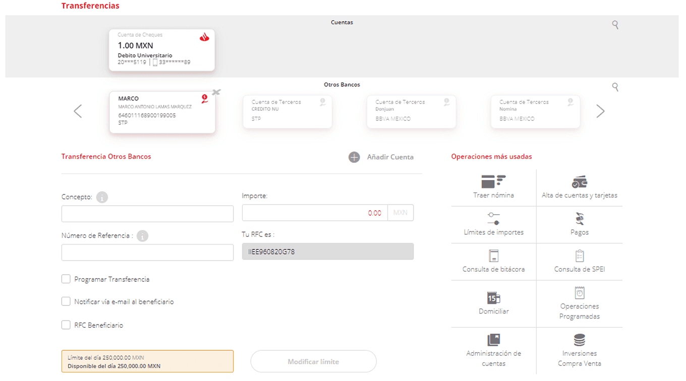
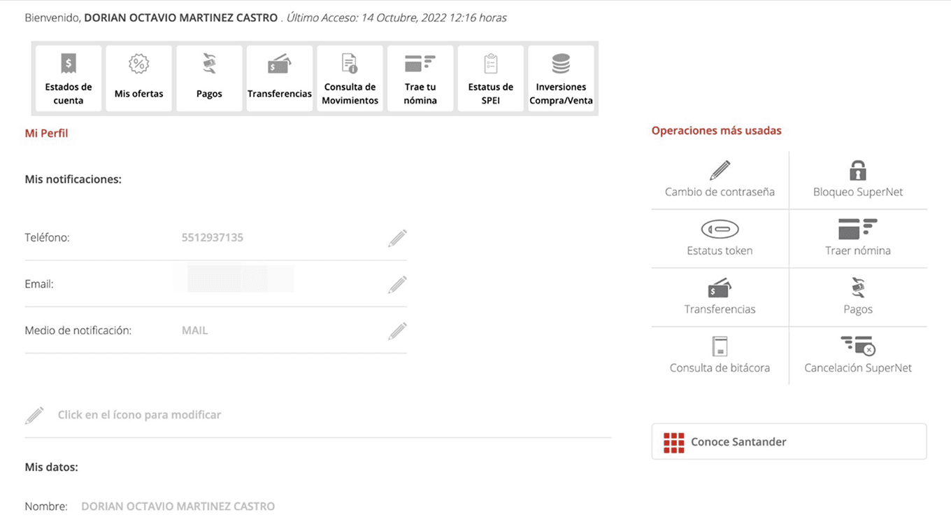
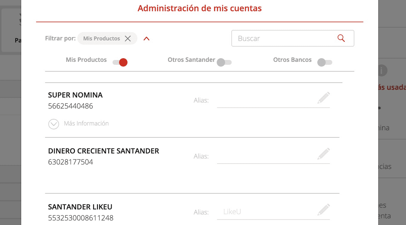
SuperNet had no clear information architecture and was severely lacking in navigability compared to our competitors. We also found problems with interactive components and the site failed our tests for UX best practices.
Approach
Having in mind what we could use from the back-end and aligning to our goals, we built our proposal recycling and refactoring existing features and design tokens. We created an MVP to test it and a roadmap for next features.
What we created
Santander Web was a challenging case that could only be built with thorough research, that's why we needed to have constant tests and analysis from the beginning to the end.
In a previous moment, a team tried to make a solution, but with severe limits in time and budget, only a discovery research and a proof of concept were created before the project was archived. This work proved very valuable and a great starting point since it already have identified our desktop users and made a detailed journey map. So, we continued our analysis with expert reviews and heuristics evaluations for both SuperNet and the archived PoC for Santander Web.
Initial research and insights
SuperNet had issues with its information architecture
At first glance, the platform seemed to have issues with interaction design and copy. But once we analysed them, it was clear the main problem was its information architecture, as much of its features were hard to reach and in places that had no contextual sense for them to be there.
The first PoC wasn't adapting to desktop correctly
This proof of concept wasn't designed with desktop usage conventions in mind, so the journeys and interactions resulted in lenghty steps for mouse and touchpad use, and some awkward navigation patterns.
With this information, we understood that our work wasn't as simple as listing features already available in the back-end and connecting them with the user flows already designed in the mobile app. We also needed to completely overhaul the architecture, navigation, and information design to really have a functional platform our users can navigate and understand with ease.
Planning
There was just one piece of the puzzle left and it was a competitor benchmark, but there was a caveat: Unlike our mobile app that serves almost all of our clients, our desktop channel is used by a reduced portion of our base so we needed to figure out what story would connect with our users
While doing our analysis, I started to recognize some patterns and conducted a semantics analysis that would identify a common layout: There was an Operations section (highlighted in yellow) that offers quick actions to a wide array of features, depending on the needs for their targeted users.
This analysis gave us great clues about what type of users our competitors were targeting in their web apps.
Thanks to our previous research, we already knew that our desktop users are high-income and high-net-worth individuals who make extensive use of our daily banking features with more than one product sending money and making payments.
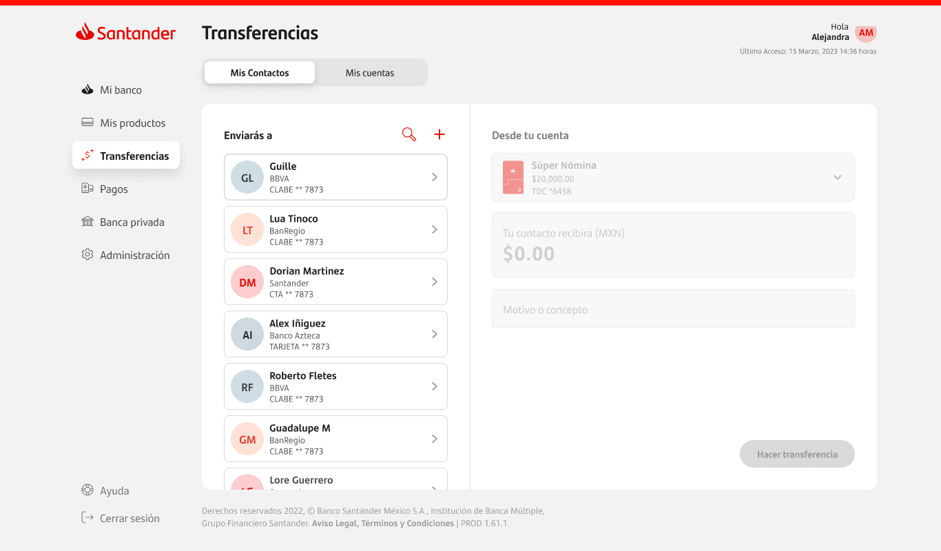
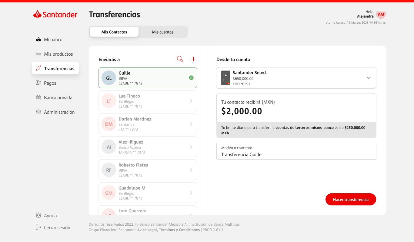
The redesign should be a place to quickly send money and make payments to the most used contacts.
The foundation
The first screen we came up with was the homepage. We tried to maximize the use of space desktop can provide, so we started with a product list, something our mobile users already see first thing after login, and then added the rest of elements according to our structure research. We even had the space for informative and promotional offers that also helped giving a visual divider for our operations and header.
We packed quick action widgets with multiple functions without needing to jump to another screen.
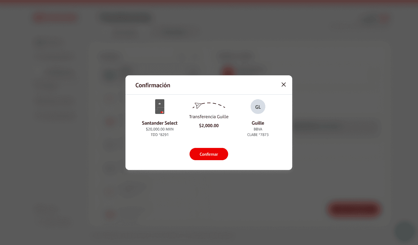
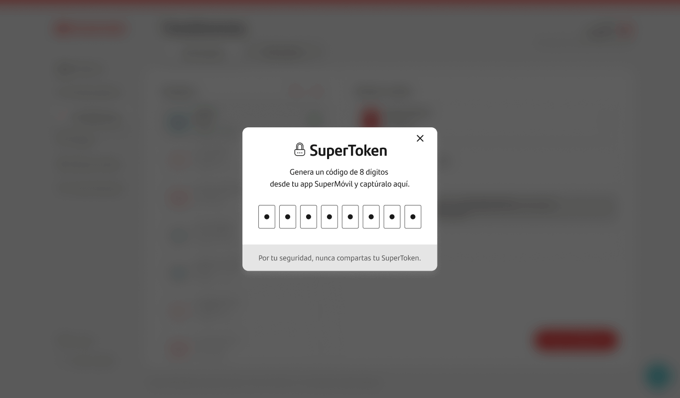
The use of 2 sections for our content gave us enough flexibility to accomodate almost any flow we already had and was simple enough to adapt for our back-end with minimal effort. We complemented this structure with pop-ups for the last mile in special cases.
After a month of exploring and refining wireframes with different structures and compositions, we designed master screens that could help us adapt any feature in our desktop experience without refactoring too much of the original flow in mobile, and that could also lay the foundation of new features from scratch.
Design system
This two screens make up the main experience of the platform ready to be populated by features and our design system. But after adapting our first flows from mobile we quickly realized that our components were never tested on desktop and we needed to create a new design system solely for desktop.
So we drafted a design system adaptation, it required a lot of work for design, research and validation with users and coworkers in the whole design dept, all while being overseen by the transversal desing system team who approved the proposal and implementation.
Create new,
desktop-native
components
Examples of components applied from the new design system built exclusively for SanWeb.
MVP proposal and testing
Credit card and investment products are the most popular product for our web users and its density in information and decision-making are great challenges for our screen-masters.
With the feedback of our designers placed in investment and credit card projects, we managed to take advantage of the space we had and give our users as much info as needed and have easy access to their most common actions.
We also tried new things in order to exploit our concept without adapting or optimizing from existing userflows.
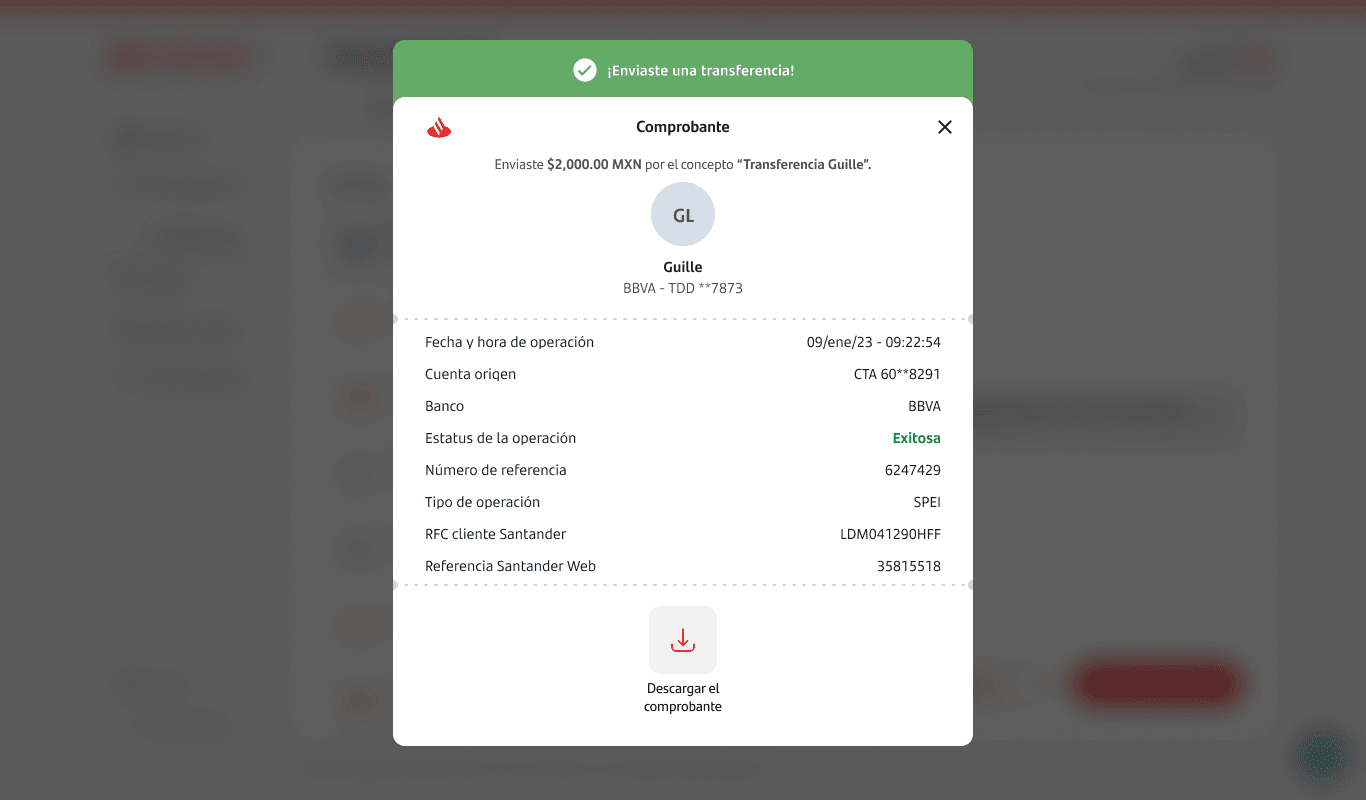
There was some talking in the team about redesigning our service payments and direct debit operations, so we took into our project the task of creating a new experience and leadind the way for the team that would tackle this in mobile.
This feature was then given to the assigned team and they finished it, both in web and mobile.
Further development
At this point, SanWeb got wind now that its foundation was built and attracted the eye of our stakeholders, team managers and other designers in the team. With our first journeys built and ready to test, the project took a shift into a bigger scale:
Guillermo took the role of supervisor and a task force entered the project with designers that were formely commisioned to daily banking features in the mobile app. They brought their expertise and knowledge of the full scope from their respective features in order to translate the mobile experience into SanWeb's own.
I transitioned to a new project while taking the role of a consultant for our team: While they were building the daily banking features, I helped giving feedback in the userflows and proposing improvements or new interactions and components for the design system.
Our work proved of value for everyone involved in the project
We could met the stablished release dates thanks to our engineers and the smooth hand-off made with the refactoring approach of the back-end in mind.
Our metrics reflect the great impact SanWeb achieve in the business goals that our stakeholders expected from the channel.
Our UX Research team performed 2 important user testings with results that validated our approach across the board with only small recommendations for improvement. The experience delivered to our users is almost the same as the one drafted by the team since the beginning.
Results
Impact
40%
increase in success rate at launch
48%
increase in NPS vs our old platform
Positive feedback
from users regarding the improved usability and visual appeal
Recognition
Santander Web also won a prize for best web design for product or service in the Clap Awards 2024, conducted by Veredictas, a foundation that works with more than 180 design associations all around Ibero-America which forms the judging committee.
Key takeaways
With such complex structures already in place, having always in mind what's already there and how to repurpose it for a better experience can be challenging but makes a great roadmap for what we can and can't do to optimize costs and efforts.
Endeavor into drastic but necessary changes can be a rough path and meet different levels of friction from all stakeholders but it's the first step of a long and rewarding investment. Communicating clearly how our design proposals can impact positively the business is the best tool for persuation.
UX design should always see the big picture. If we hadn't had the asertivity and keen eye to see the full scope of the problem this project wouldn't have existed. The underlying structures of content and design are often overlooked in favor of more appealing and direct aspects of a product.


